
The problem
Upswing Health wanted to help injured athletes identify their symptoms and find effective treatments—without having to visit a doctor. However, they didn't know which tools would work best for their users. Their goal was to attract patients and connect them with physicians, thereby getting revenue from referrals.
Our task
Our client needed a responsive website with these potential features: a step-by-step symptom checker, discussion forums where users could share information about treatments, a search function, and the ability to email a medical professional.
My role
As ATTCK's UX researcher/designer on this project, I created a survey to find out what problems people have when looking for information about injuries. What do users expect to get from a service like this? I needed to clarify their goals and concerns so that we could build only the most helpful features. Then I would deliver journey maps, user flows, a sitemap, wireframes, and a prototype.
The survey
Upswing's target audience consisted of "weekend enthusiasts" mostly over the age of 30. We distributed a survey of ten questions to Upswing's network, to patients and staff at a physiotherapy practice, and to members of a gym. We received 86 responses.
Our questions included the following:
- What's the hardest thing about looking for information?
- How do you decide if information is trustworthy?
- Tell us about the last time you looked up an injury on the web. Where did you look? Where did you end up? Were you satisfied or not?
Our key findings were illuminating: What our target users found most important was getting trustworthy information, provided by doctors. Many respondents said they were skeptical of information they found on the web. Our team agreed that even though the purpose of the site was to help users identify injuries without going to the doctor, the experience still had to have the credibility of a doctor's office.
We also found that respondents preferred "answering a series of questions" when identifying their injuries, as opposed to searching their symptoms or talking to other users (which scored very low). One respondent wrote, "I would much rather answer questions and try to figure out what's wrong instead of searching through several articles." We decided the symptom checker would be a major feature.
Here are the recommendations I made (note: Upswing Health was formerly called Athletes Like Us):
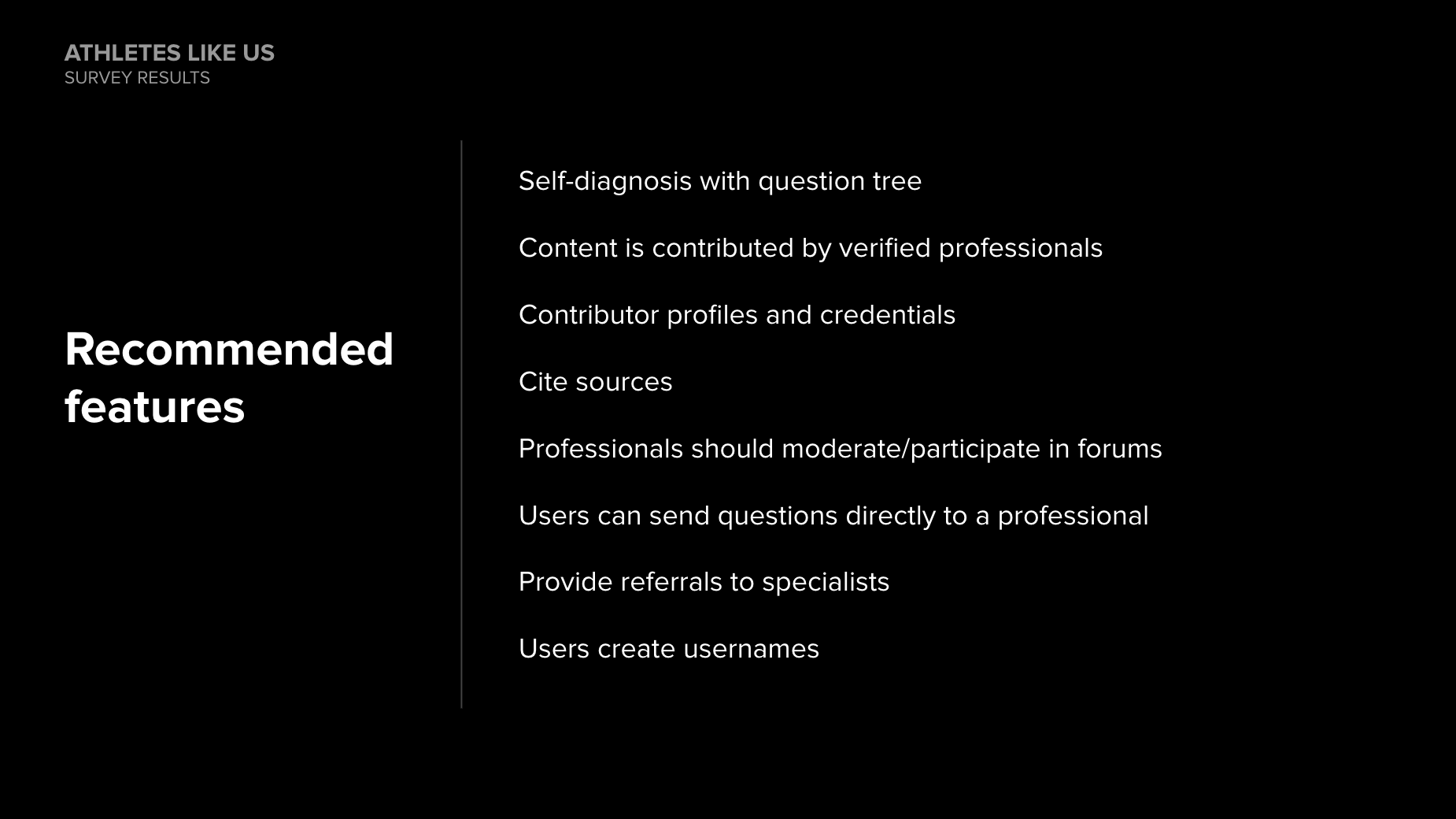
Recommended features
Upswing also made some big decisions based on this research. They would find medical professionals to participate in the discussion forums, which would make the forums more valuable. They also decided to give users the ability to communicate more closely with medical professionals—not just via email, but on live chat.
Journey maps
To identify pain points and the opportunities for solving them, I created four journey maps: "Identify an injury," "Get info about a known injury," "Use the forum," and "Sign up."
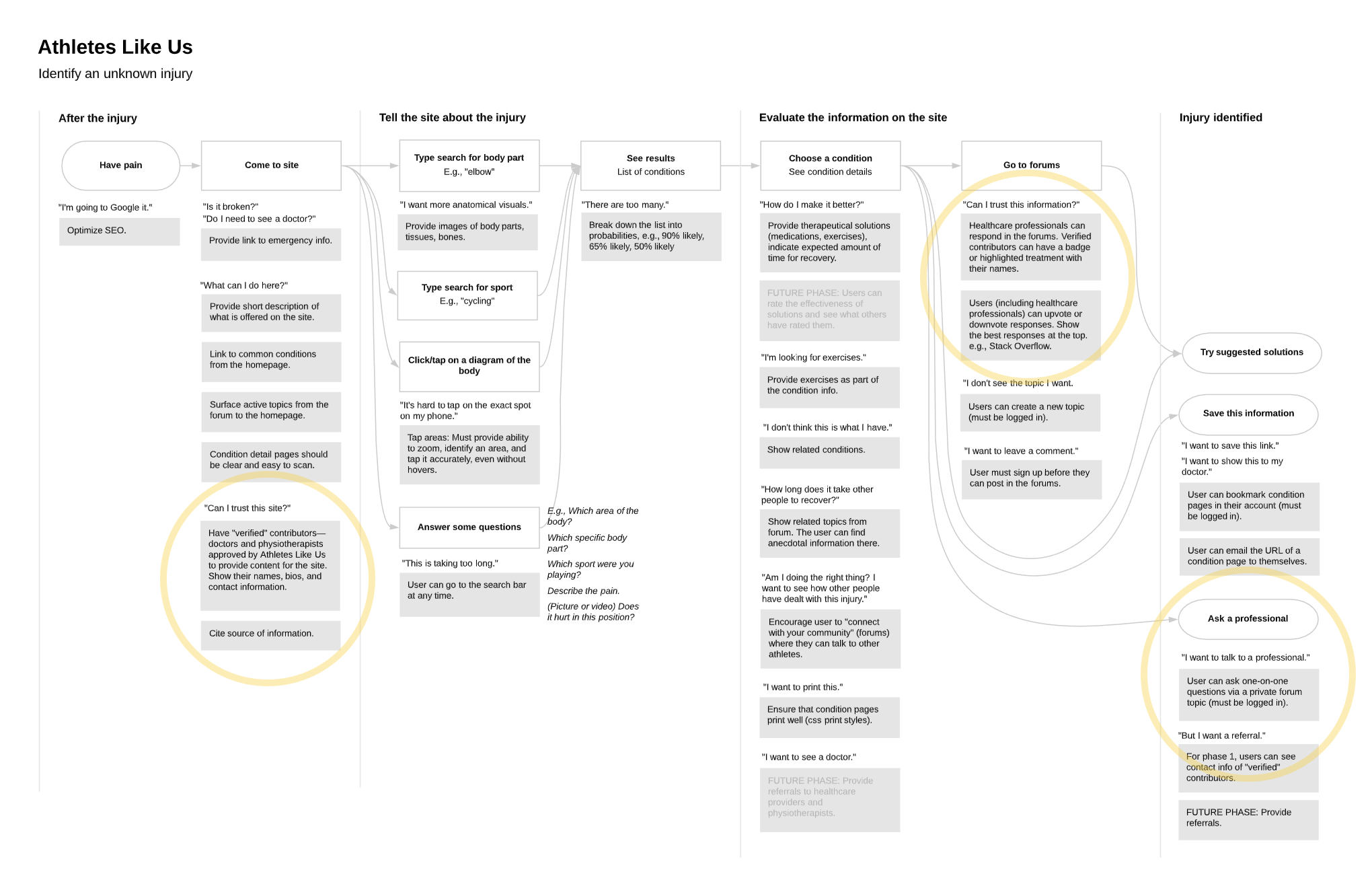
Journey map
As a way to address concerns about credibility, I recommended Upswing use "verified" contributors (physiotherapists and doctors approved by Upswing) to provide content for the site. Users could see who authored each article, including a name, photo, profile, and contact information. These verified contributors would also participate in the forums and be identified clearly using a badge or unique typography treatment.
User flow
Next, I created the user flow for the symptom checker: a series of multiple-choice questions that the user would answer in order to narrow down the nature of their injury, starting with "Where is the pain?" At the end of the flow, users would be able to identify their condition and start communicating with a professional.
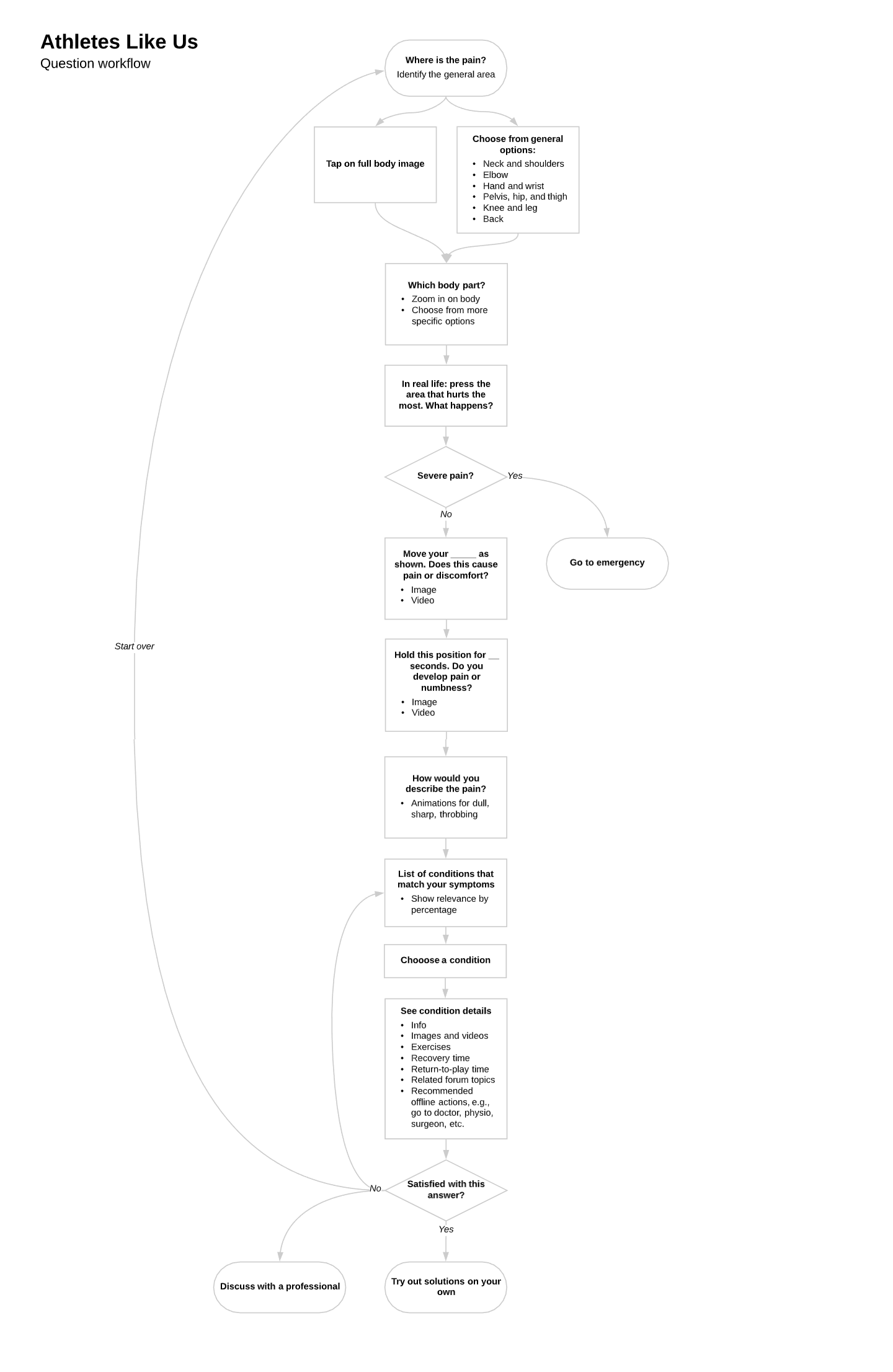
User flow
Sitemap
As I worked on the sitemap, I wanted to encourage the flow of users through the site by cross-linking the condition pages, contributor profiles, the forum topics, and the live chat: "Ask a professional." The verified contributors and medical professionals had to be a reassuring presence throughout the site.
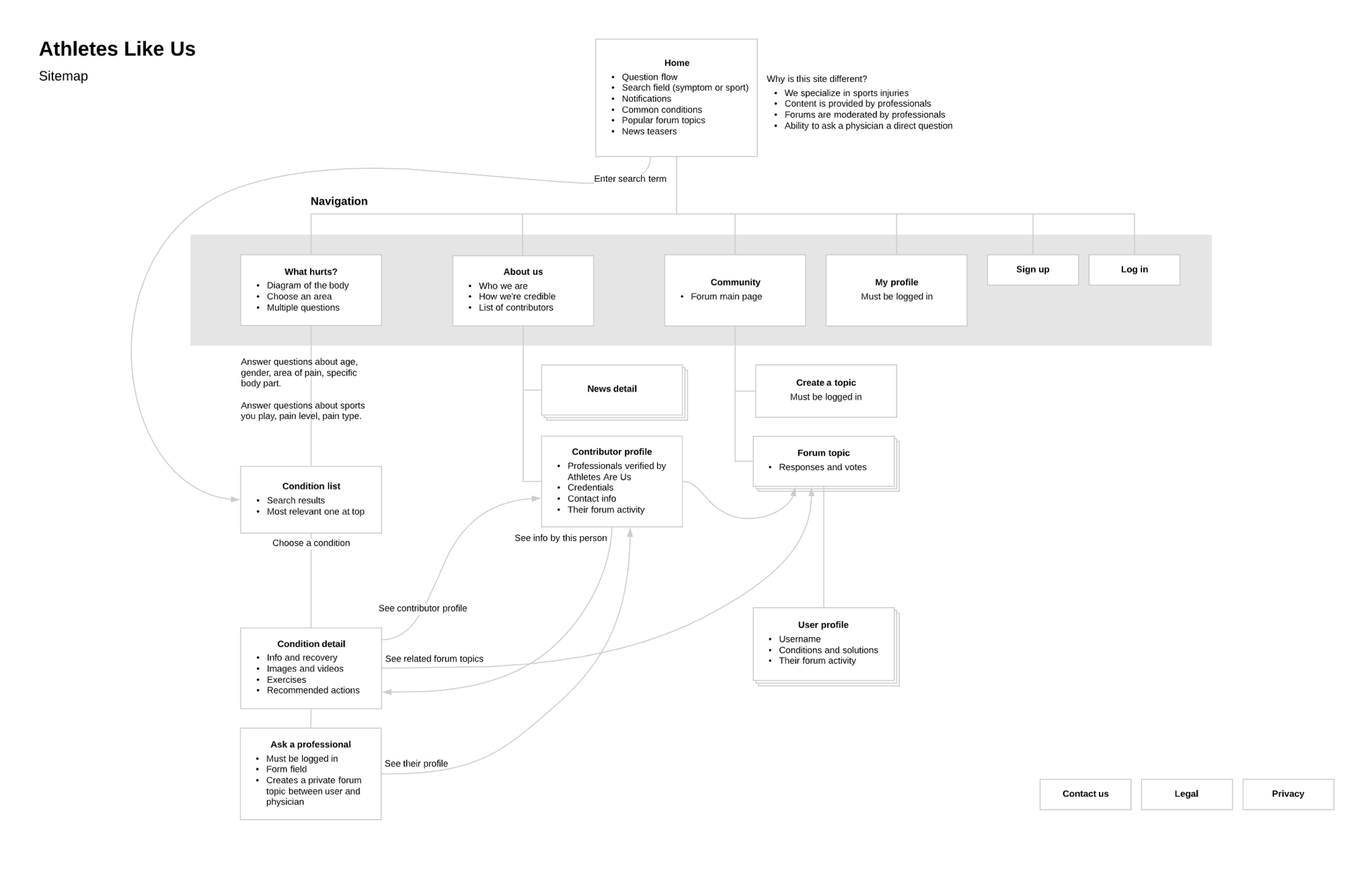
Sitemap
The symptom checker
I drafted a set of wireframes for the symptom checker. The questions would include images and videos, an idea I got from exploring Upswing's competitors' websites. I suggested that animations could be used to indicate, for instance, the quality of pain: throbbing, sharp, numb, etc. One element I struggled with was the interactive body shape that begins the flow—it was an idea that came from our client but I did not think this element felt "clickable." I asked our visual designer to help me develop the concept further.
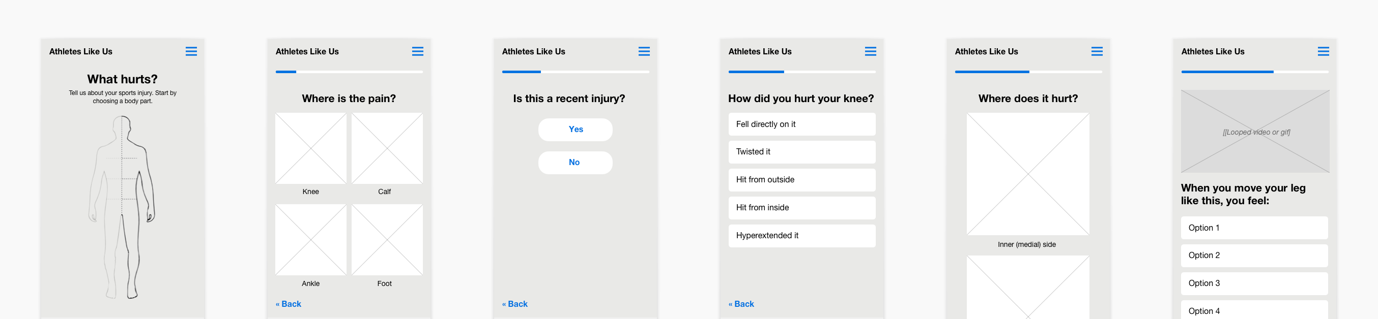
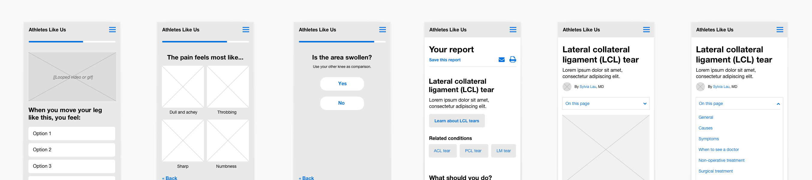
Symptom checker wireframes
The report
After completing the series of questions, the user would be shown a "report" with one or more matching conditions. From there, they can read an article, browse discussions, and chat with a professional.
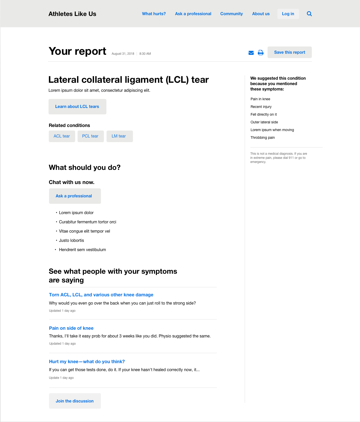
Report with suggested condition
The chat
Upswing was pleased with the way the chat concept was progressing and decided to monetize it. Users would sign up for free and be able to chat with physiotherapists and trainers—but for a fee, they could chat with a nurse, physician, or orthopedic specialist. Initially, Upswing had only planned to gather revenue from referrals. Now, the chat had become the main business goal.
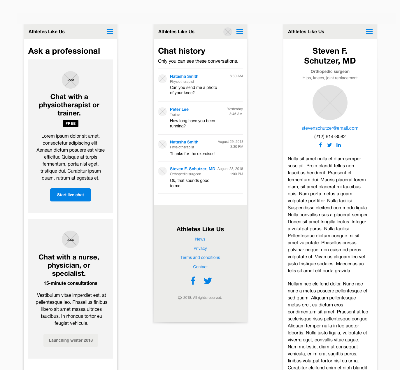
Chat with a professional
I prototyped the wireframes in InVision and our visual designer began work on the body shape interaction that had troubled me earlier, updating the prototype as he worked. Even with visual refinements, Upswing's user testing showed that people did not know where to click. Our designer added some animation to draw attention to the body shape and we added a more definite call to action: "Click where it hurts."
What I learned
Upswing Health's site evolved smartly with the help of user research. Because the target audience was so clear about wanting credible information from doctors, Upswing was able to clarify their business goals to include live chat with physicians and discussion forums with medical professionals. Thus, they launched a site that is different from their competitors and best serves their customers.
This site was featured on Top CSS Gallery, CSS Design Awards, Web Guru Awards, and CSS Light.
See the site